Introduction
to color management 2:
Profiles and Color Spaces
One of the most important functions of
Color management is to provide a link from easily
manipulated device dependent values from modes like RGB to
clearly defined device independent colors such as those
described by Lab. Color management accomplishes this with
look-up tables that translate device dependent and
independent color values. The first type of look-up table
we will discuss is called a color “profile.”
Profiles are created by sending a wide variety of signals
from a device dependent color mode to a specific device and
measuring what real colors result. In the case of a typical
inkjet printer, profiling software sends a file with
several hundred or thousand RGB (or CMYK, which is also
device dependent) values to the printer. The resulting
printed patches are read back into the profiling software
as Lab values by an instrument called a spectrophotometer.
The profiling software then generates the look-up table
that converts Lab to the exact signal “recipe”
that will produce that color on that printer.
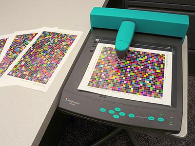
An automated
spectrophotometer reads
thousands of patches to create an ICC
profile.
Similarly, monitor profiling applications send many RGB
signals to a monitor to catalog the resulting color via
spectrophotometer (or in some cases a colorimeter). With a
monitor and printer that are accurately profiled, the ICC
color management system can take a given color, defined by
it’s device independent Lab value, and display it on
the monitor and print it on the printer so that they appear
to “match” under a specific controlled lighting
situation. Note that in these scenarios both digital
devices are using RGB mode profiles, but it is very
unlikely that the actual RGB values that they are
displaying (or printing) are the same. So a Lab color of
L30 a15 b25 might generate an RGB value of R137 G95 B71 on
a printer but R94 G61 B35 on a monitor. ICC color
management uses different device profiles to change the RGB
signal numbers to produce the same perceived color on
different devices.
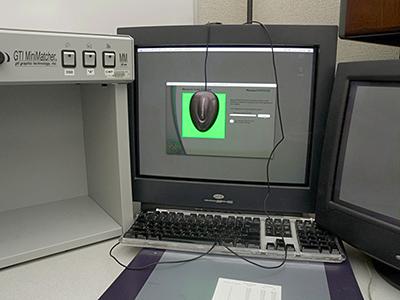
A colorimeter
reads monitor color
signals to create an ICC profile.
Accuracy is the most
important attribute of a profile. Each profile describes
the state of a device at the time the profile was created.
Making changes to the device, such as switching to a new
paper or ink set on a printer, will require a new profile
to be generated. Several things can go wrong in the
creation of a profile so testing them is essential. There
are many ways to test a profile and one of the easiest
begins by collecting a group of files that represent a wide
range of typical image color signals. When a new monitor or
printer profile is created the test files can be printed or
displayed. Comparison with known good samples can help to
point out discrepancies in the newly created profile. While
this method will show the most obvious problems with a
profile, it can sometimes be difficult to determine whether
the new profile or the control is giving a more accurate
representation of the color data in the file.
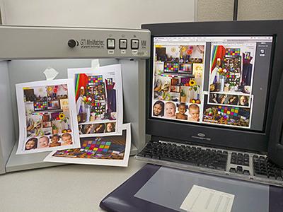
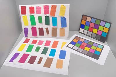
A group of images
from one output device (monitor)
is used to verify color accuracy on another (printer),
but which rendering is "correct"?
A more precise way of
checking profile accuracy is to make a perfect digital
version of a physical standard in a device independent
color mode. One example would be to create a digital
version of a GretagMacbeth ColorChecker chart based on Lab
readings of the actual chart. You can then compare the
profile’s representation of the digital chart to the
original to determine its accuracy. Finally there are a
variety of complicated electronic comparison tests that can
be performed, but these are not commonly necessary for the
average user. Simple but thorough image testing will reveal
most accuracy problems and alert you that the device needs
to be re-profiled.
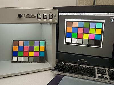
A monitor
profile's accuracy is checked
against a physical sample.
Inkjet prints
compared to actual samples
to evaluate profile output accuracy
The second type
of look up table-used by ICC color management is the color
space. Color spaces can be thought of as very large
profiles that include all the colors reproducible by a
large group of generic output devices. Color spaces are not
based on measurements like profiles, but instead assign a
large theoretical region of device independent color to the
full range of a device dependent color mode such as RGB.
Color spaces are designed as “working palettes”
to include any color that may be needed by a particular
type of user. They almost always contain a wider range of
color than a profile, and allow users to manipulate color
outside of the constraints of a particular device. Because
of the many different types of user, there are always
several very different color spaces for each device
dependent color mode. Color spaces therefore differ
primarily in the exact range of colors that they contain.
Thus they are often described in terms of their relative
“size.” Spaces that contain a wide range of
color are said to be “large” color spaces. To
use some popular RGB color spaces as examples, sRGB is a
“small” color space that attempts to only
include those colors that the average PC monitor can
accurately reproduce. On the other hand, Adobe 98 is a
larger RGB space designed to include colors from a wide
variety of scanners, monitors, printers and presses. Some
color spaces, such as ProPhoto RGB, encompass even more
colors including some that no digital devices can
accurately reproduce.
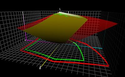
Three dimensional
graph illustrating the difference in
size (range of colors) between sRGB (green/yellow)
and Adobe1998RGB (red).
So how does one choose
which color space to use as a primary working space in
graphics programs? It is tempting to believe that bigger
color spaces are always better because they allow you
access to a wider range of colors. It should be pointed out
though that large color spaces do have some disadvantages.
For instance, all color spaces use the same number of
coordinates to describe their entire color range. So a
large color space uses the same number of steps to cover a
wider range of color. This means that the differences from
one coordinate to the next may be too extreme in an
especially large space. In these situations smooth color
transitions can be difficult in 8-bit encoding. Users who
wish to take advantage of the so-called wide gamut spaces
such as ProPhoto must use 16 bit file formats to avoid
these potential problems. This approach takes a little more
computing power, but offers the highest quality and maximum
possible color range available from an RGB color space.
Even for those of us who utilize 8-bit workflows however,
choosing a space that is larger than PhotoShop’s
default of sRGB would be an improvement. Adobe 98 has been
used sucessfully for years by graphics and imaging
professionals, so it is a difficult choice with which to
argue. Using Adobe 98 as a working space is a reasonable
compromise for those unwilling to use 16 bit encoding.
Assuming that you are using Adobe Photoshop for your
digital imaging, this can be accomplished globally though
PhotoShop’s color settings or on an image by image
basis. If you choose to change it at the Photoshop level,
your choice of working space will also affect how RGB color
information is handled by such things as the color picker
and fill patterns. Of greater importance than which color
space you use for a given file is making sure that whatever
color space is used gets communicated to a device or user
that the file is sent to.
Because each RGB color space and profile
are different, the same coordinate will have a different
color meaning depending on which color space or profile it
comes from. We stated earlier that RGB numbers by
themselves do not specify a particular color. The
additional piece needed to define RGB color is knowledge of
which RGB color space or profile was being used when the
color was created or modified. Getting RGB colors without
this information is a little like finding out that you have
to catch a plane which leaves at 8:00. If you don’t
know whether that is 8:00 AM or 8:00 PM, you could find
yourself either very early or very late. It is therefore
essential to specify information about color space whenever
color values from a device dependent color mode such as RGB
are communicated.
Ideally this information would exist as part of the file
itself so that the person or device receiving the file
would not have to guess or assign the color space manually.
ICC color management has provided a way of doing this that
is compatible with common image formats such as tiff and
jpeg called an ICC “tag.” The act of attaching
the tag to the file is called “embedding” or
simply “tagging.” Advanced imaging applications
allow you to choose to do this as part of saving the file.
For example, in Adobe’s PhotoShop you need only check
the box marked “embed color profile” when
saving to communicate your color space information in the
saved file. This allows other ICC aware applications to
correctly interpret the file’s color information,
often automatically.
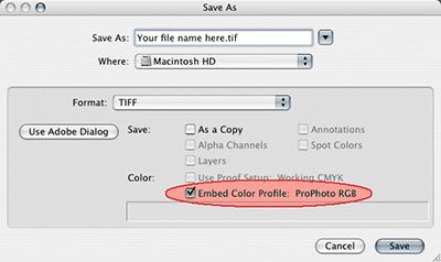
"Tagging" a
file.
While ICC color management is not a magic fix that
eliminates the need for color manipulation, it is currently
the only solution capable of keeping color representation
reasonably close across almost any digital device or
operating system. Using color management techniques can
radically streamline the digital imaging process.
Understanding the strengths and limitations of device
dependent color models promotes efficient workflows.
Working in a color space that is large enough to contain
all of the colors in an image will guarantee that
reproducible colors are not eliminated unnecessarily.
Creating accurate profiles will help to ensure that prints
and monitor representations remain reasonably consistent.
Embedding profile/color space tags allows color meaning to
be communicated to a file’s future recipient. Armed
with an understanding of these basic ICC color management
concepts, keeping color consistent becomes a more
manageable challenge.
Return to The
Educational Information home
page