Color
Management in Adobe Photoshop® part 4:
The Convert to Profile Dialog Box
(And What You Can Do With It)
With a clear understanding
of the differences between assign profile and convert to
profile, we can begin to talk about actually using these
concepts in Adobe Photoshop. If you do not have a clear
understanding of the distinction between the two, I
strongly suggest that you read or re-read the previous
section, “Assign Profile Versus Convert to
Profile”, because the rest of this series assumes
familiarity with these concepts. Assign profile and convert
to profile can be accessed directly from the top menu in
Photoshop. In Photoshop CS and earlier, this was
accomplished by selecting from the top menu Image>
Mode> Convert to profile or Assign Profile. For CS 2 and
3, choose Edit> Assign or Convert to Profile. The
convert to profile dialog looks like this:
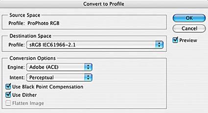
Taking the options in this
box from the top, we first see the origin space. This
cannot be changed because it refers to the color space or
profile that the image is in (or is assumed to be in.) Next
is the destination space, which is where you want to
convert your image to. Any color space or profile visible
to Photoshop is available through the destination space
pull-down menu.
Conversion options are next. These include the
“engine” or color management module (CMM) used
to perform the conversion. The CMM is essentially an
interchangeable calculator used to translate the color
meaning. In the early days of color management, some
companies “tuned” their CMMs to take advantage
of special “secret sauce” information in the
profiles created by their software. This was in direct
conflict with the platform-independent interoperability
that was a key goal of the ICC, so CMMs that favored a
specific vendor were relatively short-lived. Today few
profiling software companies bother to create separate
CMMs, and Adobe’s Ace Engine has always been one of
the best. So unless you have a specific reason to use
another CMM, such as a legacy Kodak or Heidelberg profile,
Adobe ACE is a better choice than the “operating
system freebie” CMMs.
Next down the dialog box is the rendering intent, which is
just called “intent” in some versions.
Rendering intent mainly tells the CMM how to deal with
“out of gamut” colors; colors that exist in the
source space but cannot be coded directly into the
destination. Depending on the intent chosen, some in gamut
colors are usually affected also. It should be noted that
when converting into any of the currently used
“editing” color spaces such as sRGB, Adobe 98,
ProPhoto etc., the only intent currently supported is
relative colorimetric. Photoshop CS1 and earlier allowed
absolute colorimetric as well, but this was rarely a useful
option. Adobe decided that absolute was being chosen by
mistake most of the time that it was used and discontinued
the option for CS2 and later. So while the other rendering
intent choices show up in the menu for these spaces, if you
choose one of them and click the preview box you will see
that they have no effect.
Rendering intent only becomes a real decision when
converting to an output profile such as a printer profile.
To give a brief overview of the choices, I will begin with
the two most frequently used intents, perceptual and
relative colorimetric. The remaining two intents,
saturation and absolute colorimetric, are used less
frequently and only in special situations. They will be
discussed in-depth in the “All About Rendering
Intents” (coming soon) section of the website.
Perceptual maps all possible colors (from LAB- it knows
nothing about the size of your source profile) to in gamut
ones while maintaining smooth transitions to the colors
that would have been in gamut any way. This has the
advantage of preserving smooth transitions and maintaining
relative color relationships, but tends to affect a more
significant amount of in gamut color than the other
intents. It is widely used for photographic images, where
relative color relationships are often more important than
absolute color accuracy. To maintain the relationship
between in and out of gamut colors however, severe
compression is applied to almost all color values,
including in gamut ones. This means that some saturated
colors that could be reproduced in the destination get
somewhat de-saturated. This happens even when no colors in
the source would be out of gamut.
Relative colorimetric attempts to leave all in gamut colors
unchanged, and map out of gamut colors to the nearest in
gamut choice. This makes it an excellent choice if all of
the source colors exist in the destination space. If this
is not the case however, then the transition to the
formerly out of gamut colors can be abrupt. A whole range
of out of gamut color may be translated to the single
nearest destination color. We call this “saturation
clipping” because the end points of a color range are
clipped off, or stop becoming more saturated. This changes
the relationships between colors and in extreme cases can
lead to flat blobs of saturated colors where a gradation
would otherwise be. Sometimes this is objectionable, other
times it is hardly noticeable.
The choice between perceptual and relative colorimetric is
dependent on image, profile and intended use of the
converted file. As a general rule, perceptual is often best
for translating photographic images into a small printer
profile because of it’s ability to scale out of gamut
ranges and maintain color relationships. For converting
photographic images to large gamut printer profiles, and
for accurate color conversion of non-photographic flat
color graphics, relative colorimetric is often the better
choice. There is no “one-size-fits-all” answer
here, so this is where the “preview” check box
can be pretty useful. Just keep in mind that you are
viewing the color change in the file “through”
your monitor profile. This means that if any color ranges
lie outside of your monitor’s gamut, you will be
unable to see a change even if it takes place. This usually
does not present much of a problem, and clicking preview on
and off is generally a very good way to ascertain the
effects of a profile conversion.
Next in the convert to dialog box is the option of black
point compensation. Some profiles translate their darkest
possible value directly into the space they are converted
into. This means that if you are going from an offset press
profile, which is typically not capable of producing a very
deep black, to a device profile with darker blacks, the
darkest value in the image keep the same appearance as they
had in the more limited profile. Thus you lose some
advantages of the second device by not being able to print
the darker black that it is capable of printing. Not all
profiles translate black in this way, and the difference is
due to ambiguity in the original ICC specification. Black
point compensation is an Adobe proprietary solution which
when turned on will always map the darkest possible value
in source to the darkest possible value in the destination.
Unless you are trying to duplicate a workflow that does not
offer the ability to use black point compensation, it is
always best to map black using this option by checking the
box.
Finally we have “use dither” and “flatten
image”. Use dither introduces a tiny amount of noise
to the image in the conversion process. It seems
counterintuitive, but this is actually desirable for most
photographic images. This is because any profile or color
space conversion, especially 8-bit ones, will have at least
a slight amount of rounding errors in the mathematical
conversion. The resulting loss of data, which is usually
small, is called quantization. It is almost never
noticeable on textured parts of an image, but sometimes can
be visible in very smooth gradations (like a cloudless sky)
as slight “posterization” or
“banding”. The minimal noise introduced by the
use dither control will ensure that you do not see this
banding as the result of a single transform into a normal
profile. So if you have a tonal or photographic image,
checking use dither is the way to go. If your image is a
flat graphic creation that has no gradients however, then
you probably don’t want even the slight amount of
noise that this control introduces and you should leave the
box unchecked.
The flatten control will collapse all of your Photoshop
layers before making the profile or color space conversion.
Since some layer options and blending modes are dependent
on the profile or space in use at the time, flattening
before conversion stands the best chance of keeping the
appearance of a file as unchanged as possible. Of course,
you lose the advantage of editing any of the pre-existing
layers going forward. If this presents problems, try the
conversion and use Edit>undo to toggle back and forth to
evaluate the visual difference. You must use this method
for evaluation because the preview checkbox does not
preview the effects of unchecking the flatten box. In other
words, preview will always show you the result of
flattening before the conversion.
So what can you actually do with the convert to profile
dialog? Some very useful things, including:
• Convert to another color space.
You could use convert to
profile to change a copy of your digital camera RAW
conversion in ProPhoto into a smaller space like sRGB to
email to your friends. (Most low-end image viewers assume
that everything is in sRGB) Or you could convert an sRGB
file into a larger space like ProPhoto to achieve more
saturated colors than are possible in sRGB. Please note
that if you are doing this, the conversion alone to the
larger space does not make the color in the file any more
saturated. The purpose of convert to profile is to
translate to the destination color space without changing
the color at all. To saturate the colors beyond those
available in a small space you must convert to a larger
space and then use adjustment controls like
Image>Adjust>Hue and Saturation.
• Convert to a
printer profile for printing. If you have a custom profile for your
printer, paper and ink combination, this is where you would
use it. The best approach is usually to convert to profile
and print from Photoshop. Make sure that color management
is turned off in the printer driver; you may have to
consult your printer manual for this. For an excellent
tutorial on printing with Photoshop, click
here. Note that you would not want to save
the converted version as your only copy of the file
because after the conversion it will only contain colors
that are printable under that condition, i.e. that paper
on that printer with that ink. This would limit your
ability to use a more capable printing condition and
profile in the future, so if you need to save the
converted version, save it as a copy.
• Convert to another color
mode. Most people use
Image> Mode> and choose the color mode to accomplish
this. Convert to profile can be used to convert between
most of the commonly used color modes with much greater
control. For instance, if Image> Mode> is used, then
the default working space for that mode from your Photoshop
color settings is always used as the destination space for
that mode. So if you were sending a job to a print shop
that used a profiled CMYK, press, it might seem to make
sense to use Image> Mode> to convert to CMYK and then
convert to the press profile. However, this would involve
an unnecessary conversion to your CMYK working space that
would introduce another level of quantization and could
cause additional problems with black generation. Using
convert to profile to go straight from RGB to the CMYK
press profile would be a better choice. In addition
Image> Mode> also uses your Photoshop color setting
defaults for rendering intent and dither setting. The only
way to independently control these variables for each mode
conversion is to use the convert to profile
option.
Go to part 5: The Assign
Profile Dialog Box
Return to The
Educational Information home
page