Color
Management in Adobe Photoshop® part 5:
The Assign Profile Dialog Box
(And What You Can Do With It)
Since assigning a profile
controls how the numbers in an image file are interpreted
and does not try to convert them to anything, the Image>
Mode> Assign Profile dialog box is much simpler than the
convert to profile dialog. You can see it below:
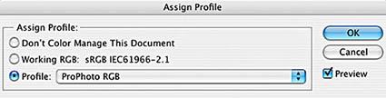
Of the three “radio
buttons”, the first control, “Don’t Color
Manage This Document” is the most complex because of
its misleading label. Photoshop’s color management is
so integral to the application at this point that it
can’t even display an image on your monitor without
using color management. So why pretend that color
management can be turned off? Probably because the whole
concept is a little scary to some people, or they have seen
incorrect color management ruin an image, and they believe
that they are better off without it. What happens when this
choice is picked is that it actually un-assigns the profile
that was being used for interpretation previously and
instead uses the default working space for the current
color mode (from your Photoshop color settings) to
determine color meaning. So if you were already using the
mode’s working space, you will not see any difference
on the monitor when this button is selected. It also makes
the default behavior for the file to have the “Embed
Color Profile” box in the “save as”
dialog unchecked. You can manually check it, and if you do
you will see that the profile that is embedded is your
default for the color mode. Since a profile is always
assigned to an image for display, and you can un-assign the
current profile by assigning another one, and because you
can uncheck the embed color profile box yourself if you
ever needed to, I can’t think of a single use for the
don’t color manage button.
The next two buttons are pretty straightforward.
“Working (color mode name):” assigns the modes
default working space from color settings, just like
don’t color manage. The only difference is that this
option does not automatically change the default behavior
of the save as dialog. If the file was saved without
embedding the last time it was saved, it will default to
that again. Otherwise, the default will be to check the
embed color profile box. Also unlike don’t color
manage, this button does have at least one use: you can
select it as a shortcut in situations when you want to
assign the default working space and you don’t feel
like scrolling through all the other choices available in
the next button, “Profile”. The profile button
allows you to assign any color space or profile for the
current document’s color mode. (Since assigning is
interpreting the numbers in an image file, you can’t
use the numbering system from other color modes.) This is
the most useful button, and you can check the preview box
to see the effects of assigning various profiles.
How can the assign profile box be used? While it is not as
often used as convert to profile, there are some situations
where it can be essential. They include:
• Assign an
input profile. You
could use assign profile to apply an input profile for a
digital camera or scanner. Next you would want use convert
to profile to convert to a trusted editing color space,
such as sRGB, Adobe ’98 or ProPhoto. This is because
input profiles are generally not linear along their neutral
axis, nor are they uniform in the size of color step
represented by a particular value. By definition they try
to reflect the inherent non-linearity and non-uniformity of
the device. So a neutral grey photographed with a digital
camera might not yield equal RGB values (R=G=B) after the
camera’s custom profile is assigned. Many Photoshop
color controls, including all grey balance samplers, assume
that R=G=B is neutral and that a change of color in one
region is roughly equivalent to a change elsewhere. To
easily use any of these controls, you must first convert to
a linear, uniform space. In fact, this is the reason that
sRGB, Adobe ’98, ProPhoto, and other spaces like
ColorMatch are called “editing” spaces; In a
totally color managed workflow, you assign your input
device’s custom profile, convert to an editing space
for editing and color correction, and finally convert to a
printer’s custom profile for output.
• Evaluate
the effect of printing or displaying a file on a profiled
device without using color management. If you have an accurate profile for a
device, you can see how the device would render the file
with no color management by assigning its profile to the
document. This is most often used in certain printing press
situations, specifically when a print shop does not use ICC
profiles but instead prints to a “standard”
print condition such as SWOP. Traditional web and offset
print houses handle color in a variety of ways, and many of
them are able to get consistently excellent results with no
use of ICC profiles whatsoever. One such method is to print
to a standardized print condition. To help those of us who
do use ICC profiles, these print conditions are
characterized as ICC profiles like U. S. Sheetfed Uncoated,
Euroscale Coated, and U.S. Web Coated (SWOP). If the print
shop doesn’t use ICC profiles but does print very
close to one of the standards, you can get a pretty
accurate “soft proof” (a “proof” on
your monitor as opposed to a “ hard” paper
contract proof) by assigning the profile for the standard.
• Try to
“guess” what profile or color space an untagged
image was created in. We will discuss embedding profiles as part
of the file saving process in the next section of
“Using Color Management in Adobe Photoshop”,
but we can talk about how to deal with the situation now.
If you receive a file that was saved without the previous
user embedding it’s profile or color space, you
cannot be one hundred percent sure what the color meanings
in the file really are. If you are able to ask the user and
get an answer, you can assign the profile or color space
and you should be okay going forward. In many cases
however, a satisfactory answer is unavailable and you are
forced to guess at what was used. The assign profile dialog
is the best tool for this because it allows you to use the
preview button to visually evaluate the effects of
interpreting the file using various color spaces on your
profiled monitor. This method of trial and error to find
the best looking option is far from perfect, and it is
entirely possible that the file uses a custom profile that
does not exist on your system. Even when common color
spaces are used, with many images it can be difficult at
best to determine where the color came
from.
Return to The
Educational Information home
page
Coming
Soon:
Part 6: Saving, Embedding, and Opening
Files